The Ultimate WordPress Conversion Rate Optimization Guide
Want to boost conversion rates? This guide covers proven CRO tips to optimize your website, landing pages, CTAs, and more — and turn visitors into customers!
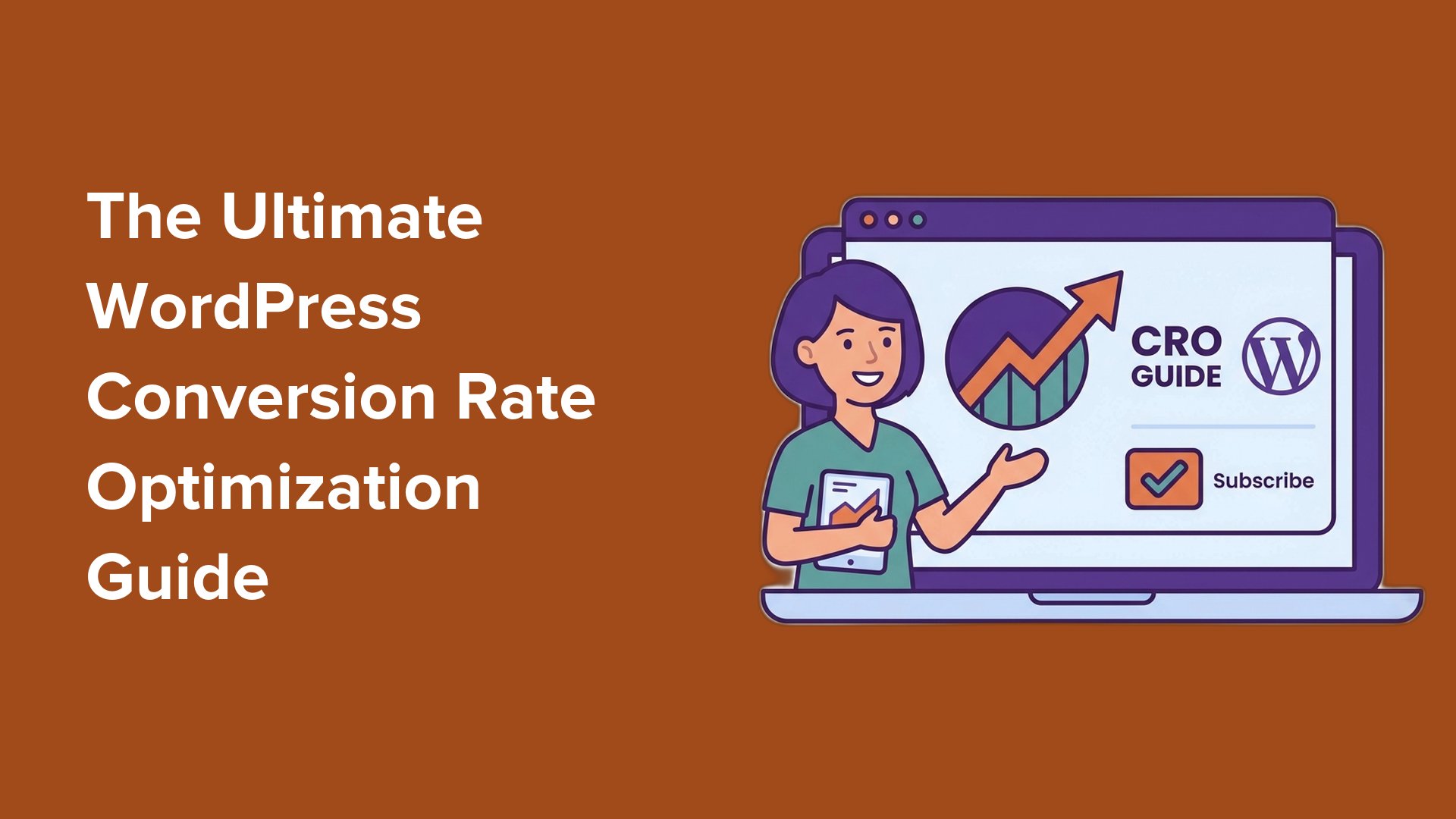
Table of Contents
- Stage 1: Foundations
- Stage 2: User Insights
- Stage 3: Optimize Key Conversion Points
- Stage 4: Building Trust at the Decision Moment
- Stage 5: Close the Sale u0026 Keep Improving
- Key Takeaways: WordPress Conversion Optimization in 5 Stages
- Checklist: WordPress Conversion Optimization in 5 Stages
- FAQs About Conversion Rate Optimization in WordPress
- WordPress Conversion Optimization Knowledge Hub
You might have plenty of traffic coming to your WordPress site, but is it actually converting? I often talk to business owners who face the same challenge: visitors keep arriving, but sales and sign-ups aren’t growing.
That’s because getting traffic is only part of the job. The real work is turning those visitors into customers, subscribers, or leads.
I’ve tested all sorts of strategies across my own websites and our clients’ sites. Some wins were small, like changing a single button or headline. Others came from rebuilding a whole page.
In this ultimate guide, I’ll walk you through every conversion rate optimization tactic I rely on, organized into 5 clear stages. You’ll also get a full CRO checklist and specific advice for WooCommerce stores, so you can start optimizing your conversion rates today.
What Is Conversion Rate Optimization?
Conversion Rate Optimization (CRO) is the process of improving your website so that more visitors complete a desired action, or “conversion.” This might be making a purchase, signing up for your email newsletter, or filling out a form.
Your conversion rate is the percentage of visitors who take that action. To calculate it, you can use this formula:
Conversion Rate = (Number of Conversions ÷ Total Visitors) × 100
For example, if 50 people make a purchase out of 1,000 visitors, your conversion rate is 5%.
A “good” conversion rate varies by industry. For an online store, 2–3% is often solid, while a dedicated landing page might see much higher numbers.
Conversion Optimization Journey (At a Glance)
To make the guide easier to follow, here’s a quick roadmap of the conversion optimization journey:
| Stage | Focus | Examples From This Guide |
| 1. Foundations | Set clear goals and track them. | Defining goals by business model, conversion tracking |
| 2. User Insights | See how people interact with your site. | Heatmaps, UX reviews |
| 3. Optimize Key Conversion Points | Make changes that encourage action. | CTAs, landing pages, personalization, testing, content updates |
| 4. Building Trust | Give visitors confidence to take the next step. | Reviews, testimonials, urgency triggers |
| 5. Close the Sale & Keep Improving | Keep improving your site over time. | Funnels, mobile optimization, retargeting, automation, monitoring |
In the following sections, I’ll share many different ways to do conversion rate optimization.
Here’s a quick overview of all the topics I’ll cover:
Let’s get started!
Stage 1: Foundations
Before you change colors, move buttons, or tweak copy, decide exactly what counts as a conversion for your business, and how you’ll measure it.
Setting Clear Goals
Your conversion goals should always match your specific business model.
Here is a quick breakdown of what you should focus on based on your website type:
- eCommerce Stores: Focus on generating more sales, increasing your average order value (AOV), and reducing shopping cart abandonment.
- Service Businesses: Focus on capturing high-quality leads, getting visitors to book a consultation call, and increasing contact form submissions.
- Blogs and Content Sites: Focus on growing your email newsletter sign-ups, increasing page views, boosting average engagement time, and improving scroll depth.
The most important metrics are usually the ones that directly impact your revenue. Start with those numbers first, and then work your way outward.
Once you know which metrics matter most to your business, it’s time to turn them into specific, measurable goals.
For instance, instead of aiming to simply “get more traffic,” you should set targets like “increase organic traffic by 20% in 3 months” or “grow email sign-ups by 15% over the next quarter.” This gives you a clear target to aim for and makes it easy to see if your optimization efforts are actually working.
To measure your progress, here are some common metrics to track:
| Metric | What It Means | Why It Matters |
| Conversion Rate | The percentage of visitors who complete a goal, like making a purchase or signing up | It’s the main way to measure CRO success |
| Engagement Rate | The percentage of sessions where users actively engage (lasting 10+ seconds, triggering a conversion event, or viewing 2+ pages) | Shows if visitors are paying attention |
| Event Completions | The number of specific actions, like form submissions, video plays, or downloads | Helps track smaller “micro-conversions” that lead to bigger goals |
| Checkout Completion Rate | The percentage of visitors who finish checkout after starting it | Highlights problems like cart abandonment |
For details on how to identify and set goals, you can see our guide on how to set up Google Analytics goals in WordPress.
Set up Conversion Tracking
Now that your goals are set, the next step is to track them so you know exactly whether your website is performing as expected and where you need to make improvements.
You can set it up directly in Google Analytics 4 (GA4) and then view the data from your analytics dashboard.

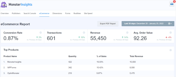
But the simplest and most reliable way is with MonsterInsights. The paid version of this popular Google Analytics plugin comes with an eCommerce addon that brings conversion data directly into your WordPress dashboard.
It allows you to see your conversion rate, transactions, revenue, average order value, and more.
Our comprehensive guide on WordPress conversion tracking made simple walks you through both options.
Stage 2: User Insights
Once you’ve set clear goals, the next step is to see how visitors actually use your site. Tracking clicks, scrolls, and engagement helps you uncover what’s working, what’s being ignored, and where small changes could lead to more conversions.
This is also the stage where you diagnose why visitors aren’t converting.
A conversion problem almost always shows up as a pattern in your data first, and each pattern points to a cause you can fix later in this guide:
- High traffic but few sales or signups: often an unclear value proposition or a weak call to action.
- High bounce or exit rates on key pages: usually friction in your layout, navigation, or page speed.
- Cart or form abandonment: too many steps or fields standing between the visitor and the finish.
- Low time on page: content that doesn’t match what visitors expected, or missing trust signals.
Creating Website Heatmaps
Heatmaps visually show you where users click, how far down they scroll, or what their mouse movements are like.
This helps you spot what’s working and what’s being ignored on your website. Plus, most modern tools mask sensitive text, so you can track user behavior without compromising privacy.
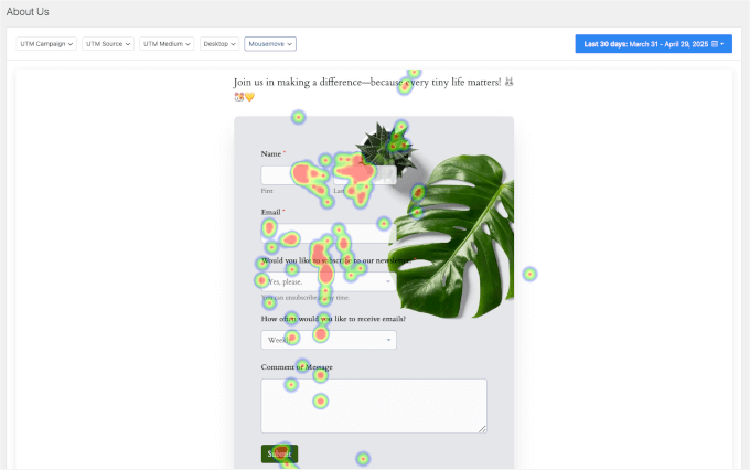
To create heatmaps for your WordPress site, I recommend using a free tool like Microsoft Clarity or UserFeedback (paid plan). For details, you can see our guide on how to set up WordPress heatmaps.
These tools help you spot patterns, such as popular click zones or areas with high drop-off rates.
You can then make targeted design improvements, like:
- Move your key elements into the hot zones. Put your primary CTA, signup or registration form, or “Add to Cart” button where clicks already cluster. If the scroll map shows most visitors never reach it, move it above the fold.
- Cut or reorder low-attention sections. Where the scroll map shows a sharp drop-off, shorten or move that content so your main offer appears before the point where most people stop reading.
- Remove the distractions that steal clicks. Heatmaps often reveal “dead clicks” on things that aren’t links, like images people mistake for buttons. Remove or redesign anything that pulls attention away from your main goal.
- Add a CTA where engagement is still high. If the scroll map shows people leaving before your only call to action, add a second one further up the page so ready-to-act visitors don’t have to scroll back to convert.
- Test one change at a time. After each layout change, check the heatmap again to confirm the click and scroll patterns actually improved before you move on to the next fix.
Doing a User Experience (UX) Audit
A user experience (UX) audit helps you understand how visitors interact with your website and where they run into problems.
A positive user experience depends on many small but important details:
- Clarity: Clean layouts and readable design help build trust and make your website easier to understand.
- Accessibility: When your site works for people with disabilities, it’s also easier for everyone to use. For more information, see our ultimate guide to improving accessibility in WordPress.
- Navigation: Clear menus, dropdowns, and search bars make it simple for users to find what they need.
- Trust signals: Customer testimonials, reviews, security badges, and professional design reassure visitors they’re in the right place and can trust your brand.
- Speed: Fast-loading pages are critical because many users will leave if your site takes more than a few seconds to load. See our complete guide to improving WordPress speed.
Every small UX improvement adds up, and over time these changes can lead to much better conversion rates. For more information, please see our guide on how to do a UX audit of your WordPress site.
Optimizing Your On-Site Search
If visitors can’t find what they’re looking for, they can’t convert. That makes your on-site search bar one of the most powerful (and most overlooked) conversion tools you have, since the people who use it are usually the closest to buying.
The biggest killer here is the zero-result search: someone types in exactly what they want, your site returns nothing, and a ready-to-buy visitor leaves for a competitor.
Unfortunately, the default WordPress search makes this worse. It doesn’t rank results by relevance, and it often misses products, documents, or custom fields entirely.
Here’s how to fix it and recover these lost sales:
- Track your zero-result searches. These logs tell you exactly what products or content your visitors want but can’t find, so you can add it, rename it, or redirect it.
- Fix your no-result pages. Instead of a frustrating dead end, display a helpful grid of related products or your most popular categories so visitors always have somewhere to go.
- Add a live search bar that shows instant, real-time suggestions as users type, guiding them to the right page faster.
We cover these tips and more in our guide on how to improve WordPress search.
Stage 3: Optimize Key Conversion Points
Now that you understand how visitors behave, it’s time to tweak the elements that drive action: clear CTAs, optimized landing and pricing pages, personalization, and A/B tests.
These are the targeted improvements that turn your insights into measurable results.
Crafting Compelling CTAs
A strong call-to-action (CTA) often makes the difference between a visitor leaving and one converting.
Effective CTAs speak directly to the user’s needs or desires and offer something valuable in return for their action.
For instance,
- Words like “Get,” “Start,” or “Claim” signal benefit and ownership.
- Phrases like “Limited Offer” or “Last Chance” tap into urgency, prompting quicker decisions.
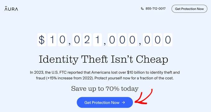
But it’s not just about what your CTA says. It’s also how it looks and where it appears. Using a contrasting color is an easy way to make the CTA stand out from the rest of the page.
For placement, CTAs often work best above the fold (the part of the screen visible without scrolling) or at the end of persuasive sections. It’s also a good idea to put them near high-engagement areas like pricing tables or testimonials.
Optimizing Landing Pages
Landing pages are one of the most important parts of your website for getting more conversions. Whether you’re promoting a product, collecting leads, or offering a special deal, your landing page should be designed with a clear goal in mind.
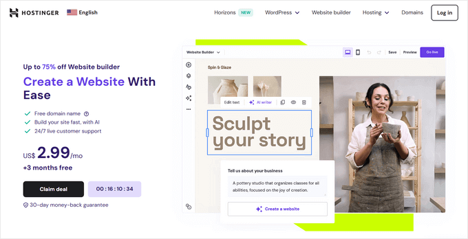
To start, nail your value proposition. This is the one line that tells a visitor exactly what they get, who it’s for, and why it’s better than the alternatives.
Your headline is where that value proposition lives, so it needs to be visible above the fold on both your homepage hero and your primary landing page. If people have to scroll to find out what you offer, many won’t.
Lead with the outcome, and be specific.
A concrete promise like “Recover your WordPress site in minutes, even after a crash” works far harder than a vague claim like “the best quality service.”
Then pair it with your primary call to action, so the next step is obvious the moment the message lands.
For inspiration, here’s an example of a landing page that gets this right:
Beyond the headline, a few design choices consistently lift landing page conversions:
- Remove distractions. Strip out your navigation menu, sidebar, and any links that lead away from the goal, so the page offers one clear path to your CTA.
- Match the message. Your headline should echo the exact ad, email, or link that sent the visitor here, so they instantly feel they’re in the right place.
- Put social proof next to the CTA. A testimonial, star rating, customer count, or trust badge right beside the button reassures people at the moment they decide.
- Repeat your call to action. On a longer page, restate the same CTA every screen or two, so visitors can act the moment they’re convinced instead of scrolling to find the button.
- Keep it fast and mobile-friendly. A slow or cramped landing page loses conversions before your copy ever gets a chance to work.
Optimizing Your Pricing Page
Your pricing page is often the final step before someone decides to buy, so the way you present your plans has a direct impact on conversions.
The goal is to make the choice feel obvious. When visitors have to work hard to compare options, many will leave instead of picking one.
Here are the tactics that make a pricing page easier to act on:
- Stick to three tiers. Too many plans create choice overload, and a confused visitor rarely buys. Three options (a budget, a middle, and a premium pick) is the common sweet spot.
- Highlight your recommended plan. Add a “Most Popular” label or a contrasting color to one tier so the eye lands there first. This anchors the decision and steers people toward the plan you most want to sell.
- Offer a monthly and annual toggle. Let visitors switch between billing cycles, and show the savings on the yearly option (for example, “Save 20%”) so the long-term plan feels like the smarter buy.
- Place a risk-reducer next to the price. A money-back guarantee, free trial, or “cancel anytime” note right by the button removes the fear of commitment at the exact moment of hesitation.
- Give each tier one clear CTA. Every plan should have a single, action-oriented button, like “Get Started” or “Choose Plan.” Competing links or extra buttons split attention and lower conversions.
You can also see our guide on how to add beautiful pricing tables in WordPress.
Optimizing Your Forms
When I audit a site with low conversions, long or confusing forms are almost always part of the problem. Fortunately, the fix is usually simple: ask your visitors for less information.
Here are the form optimization tactics that make the biggest difference:
- Only ask for what you truly need. If you don’t need a phone number to send a quote, don’t ask for it.
- Use conditional logic to dynamically show or hide fields based on previous answers, so the form stays short and relevant for each person.
- Break long forms into steps with a progress bar. This makes filling out a longer form feel much easier, especially when compared to facing one giant wall of fields.
- Show clear error messages right next to the specific field that needs attention so your visitors can instantly fix mistakes without getting frustrated.
Conditional logic and multi-step forms are the two features that make the biggest difference here, so look for a form builder that supports both.
WPForms is one beginner-friendly, drag-and-drop option: its free version handles basic contact forms, and conditional logic and multi-step forms come with its paid plans.
You can follow our tutorial on how to create a contact form in WordPress to get started.
It’s also worth protecting your forms from spam without adding friction for real users, since traditional CAPTCHA puzzles can scare away genuine customers. Most form builders include free spam tools you can switch on.
If you’d rather block spam with no CAPTCHA at all, then ActiveLayer is one tool that works behind the scenes and has a free plan to start with.
Add Personalized Offers
Personalization helps you deliver the right message to the right person, at the right time.
Instead of offering a one-size-fits-all experience, you can tailor your website’s content, offers, and CTAs based on who’s visiting and what they’ve done on your site.
This can significantly boost conversions by making your site feel more relevant and user-focused.
Here are some simple but effective ways to personalize your WordPress site:
- Show a welcome offer to first-time visitors.
- Remind returning visitors about products they viewed earlier.
- Display different CTAs based on whether a user came from social media, Google search, or your email newsletter.
- Promote time-sensitive campaigns to users browsing during holidays or weekends.
You don’t need custom code or complex logic to set this up.
A lead generation tool like OptinMonster lets you show targeted popups, floating bars, or slide-ins based on where each visitor is in your funnel.
For example, you can show a discount code to someone about to abandon their cart, or offer an eBook to a reader who has spent a couple of minutes on a related post.
Done well, personalization feels helpful rather than intrusive, which is what builds trust and lifts conversions over time.
To set this up on your own site, see our step-by-step guide on how to show personalized content in WordPress.
Using A/B Testing
If you’re making changes to your site based on guesswork, then you might be missing out on conversions. That’s where A/B testing (also called split testing) helps.
A/B testing allows you to test 2 versions of a page element, like a headline, button color, or CTA, and see which one performs better based on real user behavior.
Once you know what works, you can apply those insights across your WordPress website to steadily improve your conversion rate.
A/B testing tools like Thrive Optimize or Nelio AB Testing make it easy to experiment directly inside WordPress.
For example, you can create multiple versions of a landing page and set a specific goal, such as signups or sales. Then, the plugin will automatically split traffic and highlight the top performer.
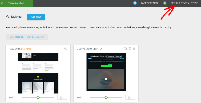
For details, please see our guide on how to run A/B split testing in WordPress.
Creating High-Converting Content
Great content doesn’t just attract traffic. It’s also a powerful tool for turning visitors into subscribers, leads, or customers.
Informative blog posts, detailed product pages, and targeted email newsletters can use persuasive copy moves people to take immediate action. To achieve this, you should always start by focusing on quality and clarity.
Your content should solve a problem, answer a question, or help the reader achieve a goal. I also recommend using a friendly, direct tone and structuring your writing so that it can be easily scanned in a matter of seconds.
Short paragraphs, bold headings, and clear takeaways make your text easier to digest. This keeps readers engaged from the first sentence to your final call to action.
🧑💻 Pro Tip: You can also use AI tools like ChatGPT to brainstorm ideas, generate blog outlines, or speed up your first drafts.
Just be sure to review and edit for accuracy and voice. AI can help you work faster, but your content still needs that human touch to connect with your audience.
I also recommend adding images or videos that support your message. Infographics can also boost engagement and make your content easier to understand.
For example, step-by-step tutorials often benefit from annotated screenshots, while product pages might convert better with explainer videos.
For more guidance, please see how to write a great blog post.
Stage 4: Building Trust at the Decision Moment
Even the best-designed page won’t convert if visitors don’t feel confident, so the next step is building trust on your WordPress site.
Social proof, testimonials, and a touch of urgency (FOMO) ease hesitation and make people more comfortable saying “yes.”
Displaying Social Proof
When visitors see that others trust your brand, they’re more likely to convert. This is the power of social proof – a psychological trigger that builds trust and reduces hesitation.
There are many forms of social proof that can influence conversions. They include testimonials, case studies, media mentions, trust badges, and social share counts.
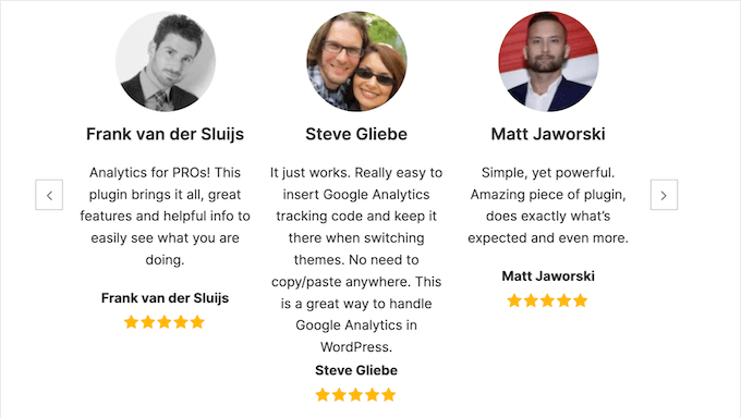
It’s a good idea to place social proof strategically across your entire website, for example:
- Add testimonials near your call-to-action.
- Show a customer quote or a recognizable client logo on landing pages.
- Use case studies on product or pricing pages.
For more details, see our guide to the best social proof plugins for WordPress and WooCommerce.
Adding Product Reviews & Ratings
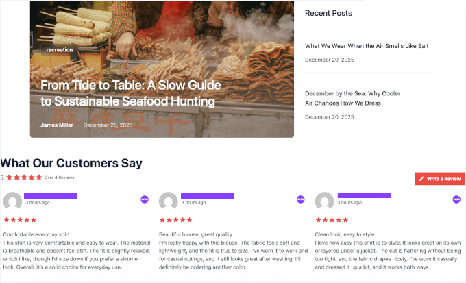
For online stores, product reviews and star ratings are among the most powerful conversion tools you have. Most shoppers read reviews before they buy, so product pages with no reviews ask customers to buy on blind faith.
Here are a few proven ways to make your product reviews work much harder on your site:
- Show star ratings near the buy button, so shoppers can see the verdict without scrolling.
- Allow photo and video reviews, since real customer images are far more convincing than text alone.
- Display reviews from external platforms like Google and Facebook. These often feel much more trustworthy to a new visitor, compared to reviews hosted exclusively on your own website.
- Don’t hide negative reviews. A perfect 5-star wall of feedback can actually look fake to savvy buyers. Shoppers are naturally suspicious of products with nothing but perfect ratings.
Out of the box, WooCommerce includes a basic product review system that lets customers leave ratings directly on your product pages. While it works, it is fairly basic if you want to do more with reviews.
To go further, a plugin like Smash Balloon Reviews Feed can automatically display customer reviews from platforms like Google, Yelp, Facebook, and Trustpilot.
Using Live Chat to Answer Buying Questions
Sometimes a visitor is completely ready to buy from you, but they have one small question holding them back. If there isn’t a fast, frictionless way for them to get an answer, they will simply leave your website, and they may never come back.
Live chat solves this problem by answering pre-sales questions in the moment, right when someone is deciding whether to click the checkout button.
Here are a few smart approaches to setting up live chat:
- Offer a way for visitors to reach a real person during standard business hours. A tool like WPChat allows customers to contact you on WhatsApp, Facebook, Instagram, and Telegram.
- Add an AI chatbot to handle common pre-sales questions 24/7, then hand off to a human when needed.
- Be proactive on key pages by automatically triggering a chat prompt on your pricing or checkout page, where shopper hesitation is always highest.
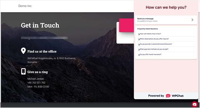
To find the perfect setup for your website, see our roundup of the best live chat software for small businesses.
Using Fear of Missing Out (FOMO)
FOMO, or the fear of missing out, is a powerful motivator. When visitors feel they might lose out on a good deal or a popular product, they’re more likely to take action quickly.
You can create a sense of urgency by offering limited-time promotions or flash sales. Countdown timers are especially effective, making the sales deadline feel real and immediate.
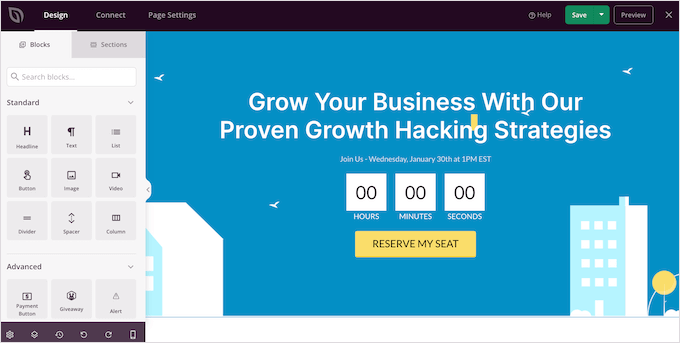
Another highly effective strategy you can use is to display real-time activity across your website.
Automatically showing small, live notifications like “Maria just purchased this item 5 minutes ago” or “10 people are actively viewing this product right now” instantly signals to new visitors that others are taking action on your site.
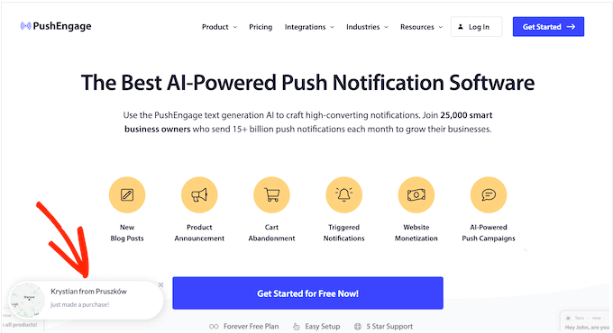
Plus, it’s very easy to set up real-time sales notifications in WordPress.
If you’re selling physical or digital products, consider displaying low stock levels or availability notices like “Only 3 left!” or “Spots filling fast.”
This can push hesitant users to decide before it’s too late.
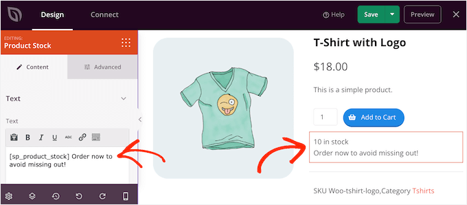
For more tips, see our guide on how to use FOMO on your WordPress site to increase conversions.
Stage 5: Close the Sale & Keep Improving
The best conversion results come from checking in regularly and making small improvements over time.
In this stage, I’ll cover refining funnels, watching how visitors behave, and using tools that help your site work smarter.
Planning Your Conversion Funnels
A conversion funnel is the journey visitors take from discovering your site to completing a desired action, like making a purchase or signing up.
The conversion funnel can be broken down into three main stages:
- Top of the Funnel (TOFU): This is where new visitors discover your brand, often via search engines or social media. Lead magnets, like ebooks or email courses, are great tools to grab attention and encourage engagement.
- Middle of the Funnel (MOFU): Visitors here are aware of your product or service and may be considering their options. The goal is to nurture their interest with more in-depth content like product demos, case studies, or free trials.
- Bottom of the Funnel (BOFU): At this stage, visitors are ready to act. Use strong CTAs like “Book Your Free Consultation” and create urgency with FOMO-driven offers or time-limited deals. I’ll talk about these topics in more detail in the next few sections.
If you have an online store, a plugin like FunnelKit can help you build these sales funnels without writing any code.
You can create full funnels from scratch or add extra steps to your existing checkout process, like order bumps or one-click upsells. It also tracks how your funnel is performing, so you can find what’s not working and make changes to boost conversions.
For step-by-step instructions, see our guide on how to make a high-converting sales funnel in WordPress.
Optimizing Your WooCommerce Checkout
If you run an online store, your checkout page is the exact spot where conversions are won or lost.
According to research by the Baymard Institute, the average cart abandonment rate is around 70%. This means roughly 7 out of every 10 shoppers who actively add an item to their cart will leave your site without completing their purchase.
The encouraging part is that most abandonment comes from fixable friction on the page, and not from people changing their minds.
Baymard’s research points to a clear list of culprits:
- Unexpected extra costs like shipping, taxes, and hidden fees are the number one reason why people leave, cited by 39% of shoppers. I recommend adding a shipping calculator to your cart page to show these costs early, or simply offering a free shipping threshold.
- Being forced to create an account drives away 19% of shoppers. That’s why you should consider enabling the guest checkout feature inside your WooCommerce settings.
- A long or complicated checkout process loses another 18% of potential customers. It’s best to remove optional fields entirely and aim for a clean, single-page layout.
- Having too few payment options turns away 10% of buyers, which we will cover in more detail in the very next section.
Beyond fixing those specific issues, a few design and structural changes consistently help WooCommerce stores convert more visitors into paying customers:
- Add a progress bar so shoppers always know how many steps remain.
- Auto-detect the user’s location to automatically fill in their country and ZIP code, which reduces the amount of typing needed on mobile devices.
- Match your checkout design to the rest of your store, so it feels secure and consistent.
- Recover abandoned carts by automatically sending timed emails and targeted web push notifications to bring hesitant buyers back.
Offering More Payment Options
Around 10% of online shoppers will completely abandon their checkout if their preferred payment option isn’t available.
The goal here is to remove every possible reason for a ready-to-buy customer to hesitate.
For that reason, I always make sure to support:
- Major credit and debit cards through Stripe. This is the gold standard for the vast majority of WooCommerce stores.
- PayPal, which millions of global shoppers trust and prefer specifically for the built-in buyer protection it offers.
- Express checkout with Apple Pay and Google Pay. This allows mobile shoppers to securely complete their entire purchase with a single tap. You can also choose exactly where the buttons appear, including on your individual product pages, cart pages, and final checkout screens.
- Buy now, pay later options like Affirm or Klarna. These can significantly increase your average order value on higher-priced items.
It’s also smart to display the logos of accepted payment methods near your buy button. These familiar brands instantly reassure shoppers that your checkout process is quick, safe, and legitimate.
If you run a WooCommerce store and want a single native option, WooPayments handles most of these methods, including cards and express checkout, directly inside WooCommerce without a separate gateway extension.
If you sell outside of WooCommerce (such as accepting a one-off payment, a deposit, or a donation) then WP Simple Pay lets you accept Stripe payments without setting up a full shopping cart.
Optimizing for Mobile Users
With over half of all web traffic coming from mobile devices, a poor mobile experience can quickly cost you conversions. If visitors have to pinch, zoom, or wait for slow-loading pages, they’re more likely to leave and never return.
It’s also not just about shrinking your site to fit a smaller screen. True mobile optimization involves touch-friendly navigation (like larger buttons and easier menus), readable fonts, enough spacing, and a streamlined checkout process.
Additionally, you should watch out for these common mobile pitfalls:
- Slow mobile load times. Be sure to compress images, minimize scripts, and use caching plugins to make your pages load quickly on mobile devices.
- Overloaded layouts. What looks great on a desktop may feel cramped on a phone. Simplify where possible, especially on landing pages.
- Unoptimized popups. Intrusive popups can frustrate mobile users. Use mobile-specific rules to display more subtle offers (like banners or slide-ins) on smaller screens.
To make your site mobile-friendly, you should start by choosing a responsive theme.
The best themes will allow you to fine-tune how each section of your page appears on phones and tablets.
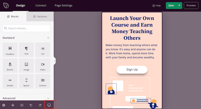
For a complete walkthrough, see our guide on creating a mobile-friendly WordPress site.
Win Back Lost Visitors With Retargeting
Most website visitors won’t convert on their first visit. But that doesn’t mean the opportunity is lost. With retargeting, you can stay top-of-mind and guide them back to your site when they’re ready to act.
Here’s how retargeting works: when someone visits your site, a tiny piece of code from an ad platform (often called a ‘pixel’) is triggered. This pixel uses a cookie (or first-party data in privacy-first systems) to place a unique, anonymous identifier in their browser.
You can then segment these audiences based on behavior, such as:
| Segment | Description |
|---|---|
| Segment 1 | Users visiting a specific product or service page |
| Segment 2 | Users adding an item to the cart but not checking out |
| Segment 3 | Users spending a certain amount of time on your site |
Behavior-based targeting makes your ads highly relevant and more effective because these users already know your brand.
To get the best results, you’ll want to:
- Tailor your ads based on what users did on your site. Don’t show the same ad to every user. Use dynamic ads or multiple creatives based on actions they took (or didn’t take).
- Limit ad frequency: Use the frequency capping settings in your ad platform to avoid ‘banner fatigue.’ Don’t worry, major platforms like Google and Facebook Ads include frequency capping controls for this. It prevents users from ignoring your ads because they’ve seen them too often, since overexposure can actually hurt your brand perception.
- Set a smart retargeting window. For example, you might retarget abandoned carts within 3 days and bounce visitors within 7–14 days.
For step-by-step instructions, see our guide on how to use cookie retargeting in WordPress.
Key Takeaways: WordPress Conversion Optimization in 5 Stages
To wrap things up, following these five clear stages gives you a proven blueprint for optimizing your WordPress website and boosting your overall conversion rates.
Here’s a quick recap of everything I covered in this guide:
- Start with a strong foundation: Set clear goals based on your business model, then track them to guide your conversion strategy.
- Gather user insights: Use heatmaps, analytics, and UX reviews to see how people interact with your site and find friction points.
- Improve site elements: Optimize CTAs, landing pages, personalization, and content to make it easy for users to take action.
- Build trust: Add social proof, reviews, testimonials, and urgency triggers to make visitors confident in converting.
- Focus on ongoing growth: Refine conversion funnels, optimize for mobile, use retargeting and automation, and monitor performance regularly.
Checklist: WordPress Conversion Optimization in 5 Stages
Here’s a checklist you can work through stage by stage:
Stage 1: Foundations
☐ Define your conversion goals based on your business model (sales, leads, or sign-ups)
☐ Choose the supporting metrics that map to those goals
☐ Set up conversion tracking in Google Analytics
Stage 2: User Insights
☐ Install a heatmap tool and review click and scroll behavior
☐ Run a UX audit for clarity, navigation, and trust signals
☐ Improve on-site search and review zero-result searches
Stage 3: Optimize Key Conversion Points
☐ Use one clear, benefit-driven CTA per page
☐ Sharpen your landing page headline and value proposition
☐ Shorten your forms and add conditional logic
☐ Add personalization for new vs. returning visitors
☐ Run an A/B test on one element at a time
☐ Make your content scannable and action-focused
Stage 4: Building Trust
☐ Add testimonials and social proof near your CTAs
☐ Display product reviews and star ratings (including photos)
☐ Add live chat to answer buying questions
☐ Install an SSL certificate and show trust badges
☐ Use genuine urgency and FOMO, never fake timers
Stage 5: Close the Sale & Keep Improving
☐ Map your TOFU, MOFU, and BOFU funnel
☐ Streamline your WooCommerce checkout and enable guest checkout
☐ Offer multiple payment options, including express and BNPL
☐ Optimize the mobile experience end to end
☐ Set up retargeting with proper cookie consent
☐ Review your metrics on a regular schedule
FAQs About Conversion Rate Optimization in WordPress
Not sure where to start with improving your WordPress site conversions? Here are some of the most common questions we get from readers:
How do you optimize conversion rates in WordPress?
Start by setting clear goals, tracking your conversions with the right tools, and studying how visitors actually behave on your site.
Once you have that data, you can focus your energy on the highest-impact changes. This includes creating clearer CTAs, shortening your forms, displaying stronger social proof, and building a smoother checkout experience.
There are plenty of powerful conversion optimization tools available to help you execute each of these steps, from advanced analytics and A/B testing plugins to smart popups and sales funnel builders. However, it is important to remember that your strategy should always come first.
How do you measure CRO?
You measure CRO by tracking how many visitors complete a desired action, such as signing up, making a purchase, or filling out a form, and then comparing it to your total traffic.
Analytics tools like Google Analytics, or a plugin such as MonsterInsights, can show you these numbers and calculate your conversion rate automatically.
What is the formula for conversion rate optimization?
Here’s a simple formula you can use:
Conversion Rate = (Number of Conversions ÷ Total Visitors) × 100
So, if 50 people sign up for your newsletter out of 1,000 visitors, your conversion rate is 5%.
What is a good CRO tool?
Popular CRO tools for WordPress include OptinMonster for lead generation, MonsterInsights for tracking behavior, Thrive Optimize for A/B testing, FunnelKit for sales funnels, and UserFeedback for collecting visitor insights.
How much does a good CRO tool cost?
Many CRO tools have a free version or a free trial, so you can start without spending anything. Paid plans are usually billed monthly or yearly, and the price scales with the features you need and your site’s traffic.
WordPress Conversion Optimization Knowledge Hub
Want to go even deeper? Here are some additional companion resources that pair perfectly with this guide, grouped by what you are trying to achieve next on your website.
Get Set Up & Track Results
- How to Install Google Analytics in WordPress
- How to Create an Email Newsletter
Capture & Nurture Leads
- Best Email Marketing Services Compared
- Best CRM Software for Small Business
- What Are Web Push Notifications and How Do They Work?
Improve & Convert
- Best WordPress SEO Plugins and Tools
- Best WordPress Popup Plugins
Grow Your Online Store
- Ultimate WooCommerce SEO Guide
- How to Start an Online Store (Step by Step)
If you liked this article, then please subscribe to our YouTube Channel for WordPress video tutorials. You can also find us on Twitter and Facebook.