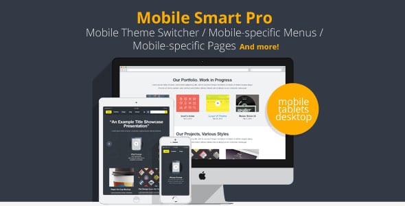
Mobile Smart Pro 1.4 – Mobile Switcher, mobile-specific content, menus
Product Documentation
Complete technical overview and features
Mobile Smart Pro – Mobile Switcher, mobile-specific content, menus
Outline:
- Introduction
- Importance of Mobile Optimization
- Mobile-Friendly Design
- Mobile-Specific Content
- Mobile Switcher
- Benefits of Mobile Smart Pro
- Seamless User Experience
- Improved Conversion Rates
- Enhanced SEO Performance
- Implementing Mobile Smart Pro
- Installing the Plugin
- Customizing Mobile Switcher
- Creating Mobile-Specific Content and Menus
- Best Practices for Mobile Optimization
- Responsive Design
- Optimizing Page Load Speed
- Simplified Navigation
- Clear Call-to-Actions
- Conclusion
Mobile Smart Pro – Mobile Switcher, mobile-specific content, menus
In today’s digital landscape, mobile devices have become an integral part of our lives. With the increasing use of smartphones and tablets, it is crucial for businesses to optimize their websites for mobile devices. Mobile Smart Pro is a powerful tool that enables website owners to create mobile-friendly experiences, mobile-specific content, and menus to cater to their mobile audience effectively.
Importance of Mobile Optimization
Mobile-Friendly Design
Having a mobile-friendly website design is essential to provide a seamless user experience across different devices. With Mobile Smart Pro, you can ensure that your website looks and functions optimally on mobile devices, eliminating the need for users to zoom in or scroll excessively.
Mobile-Specific Content
Mobile Smart Pro allows you to create mobile-specific content tailored to the needs and preferences of your mobile users. This feature enables you to showcase relevant information prominently and make it easily accessible on smaller screens, enhancing the overall user experience.
Mobile Switcher
The Mobile Switcher functionality of Mobile Smart Pro automatically detects the device used by a visitor and redirects them to the mobile version of your website. This feature ensures that users are directed to the version that is best suited for their device, providing a seamless transition between desktop and mobile browsing.
Benefits of Mobile Smart Pro
Seamless User Experience
By utilizing Mobile Smart Pro, you can offer your mobile users a seamless browsing experience. The plugin ensures that your website adapts to different screen sizes, delivering a visually appealing and user-friendly interface. This seamless experience helps in engaging and retaining your mobile audience.
Improved Conversion Rates
With Mobile Smart Pro, you can optimize your website for mobile conversion. By tailoring the content and design specifically for mobile users, you can create a smooth conversion process. Mobile Smart Pro empowers you to add mobile-specific call-to-action buttons and forms, making it easier for visitors to take desired actions, such as making a purchase or submitting a contact form.
Enhanced SEO Performance
Mobile optimization plays a crucial role in search engine optimization (SEO). Mobile-friendly websites are favored by search engines and tend to rank higher in mobile search results. Mobile Smart Pro helps in optimizing your website for mobile SEO, ensuring that your content is easily discoverable by mobile users and improving your website’s overall visibility.
Implementing Mobile Smart Pro
Installing the Plugin
To get started with Mobile Smart Pro, you need to install the plugin on your website. Simply navigate to the WordPress dashboard, go to the “Plugins” section, and search for “Mobile Smart Pro.” Click on the “Install Now” button, and once the installation is complete, activate the plugin.
Customizing Mobile Switcher
After installing Mobile Smart Pro, you can customize the Mobile Switcher settings to fit your requirements. The plugin offers various options to configure the behavior and appearance of the mobile switcher, such as device detection, redirection rules, and mobile theme selection.
Creating Mobile-Specific Content and Menus
Mobile Smart Pro allows you to create mobile-specific content and menus effortlessly. With its intuitive interface, you can easily design and customize mobile pages, posts, and menus to provide a tailored experience for your mobile users. This feature ensures that your mobile audience gets access to the most relevant information conveniently.
Best Practices for Mobile Optimization
To maximize the effectiveness of Mobile Smart Pro and ensure a superior mobile experience, consider implementing the following best practices:
Responsive Design
Utilize responsive design principles to ensure that your website automatically adapts to different screen sizes and orientations. This approach guarantees that your content remains accessible and visually appealing across all devices.
Optimizing Page Load Speed
Mobile users expect fast-loading websites. Optimize your website’s page load speed by compressing images, minifying CSS and JavaScript files, and leveraging caching techniques. Mobile Smart Pro helps by ensuring that your mobile pages are optimized for quick loading.
Simplified Navigation
Streamline your website’s navigation for mobile users. Use clear and concise menus, limit the number of clicks required to reach essential information, and provide prominent search functionality. Mobile Smart Pro offers customization options to simplify navigation specifically for mobile users.
Clear Call-to-Actions
Mobile users often have limited time and attention span. Make your call-to-action buttons and forms clearly visible and easy to interact with. Mobile Smart Pro enables you to create mobile-specific call-to-actions that are optimized for touch interaction, increasing the likelihood of conversions.
Conclusion
Mobile Smart Pro is a valuable tool for optimizing your website for mobile devices. By implementing this plugin, you can create a seamless user experience, improve conversion rates, and boost your website’s SEO performance. With the increasing importance of mobile optimization, Mobile Smart Pro is a must-have for any website owner looking to cater effectively to their mobile audience.
Share this product
Clean Code
Well-structured & documented
Responsive
Works on all devices
Fast Loading
Optimized performance
Support
Professional assistance
User Reviews
Community feedback and ratings
No reviews yet
Be the first to review this product!
Comments (1)
Join the discussion and share your thoughts
Great performance and speed.
Related Products

ACF Extended Pro 0.9.1 – Supercharge Advanced Custom Fields
ACF Extended Pro – Supercharge Advanced Custom Fields In the ever-evolving world...

ACF Frontend Form Element Pro 3.9.23
ACF Frontend Form Element Pro: Enhancing User Experience in WordPress Introducti...

ACF Theme Code Pro 2.5.6
ACF Theme Code Pro – Supercharging Your WordPress Theme Development Are yo...

Address Autocomplete For WooCommerce 1.2.0
Address Autocomplete for WooCommerce The Address Autocomplete for WooCommerce pl...
Get This Product
Product Details
Security Verified
Clean & Safe
Scanned by 60+ antivirus engines
✓ Original files only
✓ Regular security checks